Logo Placement Matters: How Better Artwork Makes Promotional Products Look More Professional
A promotional product can be useful, well-made, and perfectly matched to your audience. But if the logo looks awkward, crowded, too small, too large, low contrast, or poorly placed, the entire item can feel less professional.
Logo placement is not a minor detail. It affects how people see your brand. A clean, balanced imprint can make a simple product look polished and intentional. Poor artwork can make even a high-quality product look rushed, cheap, or hard to trust.
Why Logo Placement Matters
Promotional products are not flat posters. They have curves, seams, textures, handles, zippers, pockets, lids, sleeves, and small decoration areas that all affect how a logo appears.
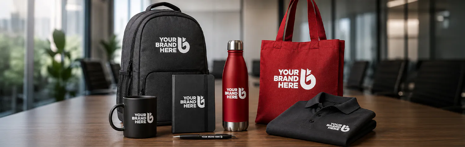
A design that looks strong on a screen may not work the same way on a water bottle, hat, tote bag, pen, mug, hoodie, notebook, or golf shirt. Good placement considers how the item will be held, worn, carried, stored, photographed, or viewed from a distance.
The goal is simple: make the logo easy to see, easy to recognize, and visually balanced on the product.
Great Logo Design Makes Promotional Products Easier to Produce
Strong promotional products start with a strong logo. A clean, flexible logo gives you more options across different products and decoration methods.
Complicated logos can create production problems. Too much detail may disappear on small items. Thin lines may not embroider well. Gradients may not reproduce cleanly. Too many colours can increase cost, slow down approvals, and make the logo harder to reproduce consistently on different materials.
A good promotional logo should be simple enough to print, stitch, engrave, transfer, or emboss without losing its identity. That does not mean boring. It means practical, clear, and built for real-world use.
Your Logo Needs Alternate Layouts
One logo layout will not work everywhere.
A horizontal logo may look great on a website header or tote bag, but it may be too wide for a pen, sleeve, cap, or narrow imprint area. A stacked logo may work better on mugs, labels, patches, and square spaces. A simplified icon may be best for small items, zipper pulls, embroidery, or subtle branding.
Every business should have a flexible logo system. That may include a horizontal version, stacked version, icon-only version, one-colour version, reversed version, and simplified small-size version.
These alternate layouts help your brand stay consistent without forcing the wrong artwork into the wrong space.
Readability Matters at Every Size
Your logo should be easy to read on a billboard and on a pen.
That is the real test.
If your logo only works when it is large, it may fail on many promotional products. Small imprint areas expose weak logo design fast. Thin type, complex icons, tiny taglines, and low contrast can become unreadable when reduced.
Before ordering branded merchandise, check how your logo performs at different sizes. Can someone read it quickly? Does the icon still make sense? Does the company name stay clear? Does the design hold up in one colour?
If the answer is no, the artwork may need adjustment before production.
What to Consider Before Ordering
Before approving artwork, review the product shape, imprint area, colour, material, and decoration method.
A wide logo may work well on a tote bag but look cramped on a tumbler. A detailed logo may look sharp on a notebook but lose clarity on a pen. A dark logo on a dark product can disappear. A low-contrast design may look subtle in theory but weak in real life.
Decoration method also matters. Screen printing, embroidery, laser engraving, pad printing, heat transfer, debossing, and direct print all have different strengths. The right method depends on the product, material, logo detail, colour count, and desired finish.
Common Mistakes to Avoid
Do not assume one logo file works for every product.
Do not force too much information into a small imprint area. A logo, website, phone number, tagline, and social handles may sound useful, but too much clutter weakens the design.
Do not ignore colour count. More colours can mean higher production costs and more complexity, especially when decorating different surfaces.
Do not skip the proof. The proof is your chance to catch sizing, placement, spelling, contrast, layout, and readability issues before production begins.
How Justbrandit Helps
Justbrandit helps businesses locally in Southern Ontario and across Canada create promotional products that look professional from the first proof to final delivery. We review logo placement, artwork quality, product fit, decoration options, colour use, and imprint size so your brand shows up clearly and confidently.
Through our relationship with sister company AS Advertising, we bring decades of branding, design, and advertising experience into every promotional product order.
We also work with Canadian suppliers and decorators, quoting and supplying goods in Canadian dollars to help avoid added duty surprises.
Need branded merchandise that looks as good as your brand deserves? Justbrandit can help you get the artwork right before it goes into production.